Monday, May 29, 2023

Why the long face, part 2

My last post said that the low ratings of current economic conditions weren't the result of increased partisanship--it's not just Republicans who rate them as poor, but people of all parties.  Of course, "economic conditions" can cover a lot of things, so let's look at some of the alternative measures.  Gallup has a question going back to 2001:  "Thinking about the job situation in America today, would you say that it is now a good time or a bad time to find a quality job?"  The last time it was asked (January 2023), 64% said it was a good time and 33% said it was a bad time.  That's good by historical standards--higher than it ever was before August 2017.  So people are quite positive about one important aspect of the economy.  Gallup also has this question:  "Next, we are interested in how people’s financial situation may have changed. Would you say that you are financially better off now than you were a year ago, or are you financially worse off now?"  As of January 2023, 35% say better off and 50% say worse off.  That's about where it was in the recessions of 1992-3 and the early 2000s, and somewhat better than the worst years of the "Great Recession" (the graph is here).  

The second Gallup question is just about the same as one of the two items in the Michigan index--the other one is about whether it's a good time to buy major household items.  Opinions on these two questions follow different patterns--for the financial situation, the Michigan question is similar to the Gallup one--the current value is low, but not exceptionally low.  For the "good time to buy" it is exceptionally low--lower than it ever was in the "Great Recession" or the recessions of the 1970s and early 1980s (graphs can be found in the "data booklets" here).  This question isn't purely about current or recent conditions--to some extent it's looking ahead.  That is, someone who thinks that economic conditions will get worse will hesitate to make a large purchase.  This is probably a factor now--the economic situation seems uncertain.  

As far as the "better off than a year ago" results, the government spent unprecedented amounts to protect people from the Covid recession.  As a result, ratings of how your situation compared to a year ago were not that bad in 2020 and early 2021, even though unemployment passed 10%.  But the other side of that is that as the aid was cut back and the recovery was slower than expected, people became more negative.  Also, although I'm not sure, my impression is that businesses (especially large businesses) absorbed more of the blow in 2020-21--they didn't lay off as many people as they could have and didn't make much effort to cut wages--but when conditions improved, they have made up for that by holding the line against wage increases.  So people's standard of living didn't fall as much as the unemployment numbers would suggest in 2020-21, but hasn't risen as much as they'd suggest in 2022-3.  

[Some data from the Roper Center for Public Opinion Research]

Tuesday, May 23, 2023

Why the long face?

 Paul Krugman recently asked why people have negative views of the economy even though economic conditions are pretty good.  He suggested that one reason was partisanship--specifically, that Republicans have become more likely to rate the economy as bad just because a Democrat is in office.  I discussed this possibility back in July 2021 and said that there was a clear increase in the effect of partisanship on economic expectations, but that we couldn't be sure about whether there was a change in the effect on ratings of current conditions.  But that was early in Biden's presidency, so there's more information now (data are from the Michigan Surveys of Consumers, which are conducted every month).   The partisan gap (president's party minus opposition party) in ratings of current conditions* and expectation of future conditions:

                            Current            Expected        Observations

Carter                         5.5                  3.1                          1
Reagan                      16.0               23.3                          5
GW Bush                  16.6               18.4                        10
Obama                        7.6               23.3                        25
Trump                       21.7               52.0                        46
Biden                        19.3               44.0                        30

The partisan gap in expectations became larger under Trump and has remained large under Biden.  But the gap in ratings of current hasn't shown any trend--the only thing that stands out is that it was smaller under Obama.  So the issue isn't that Republicans are particularly negative:  it's that everyone is.  Currently, Democratic ratings of the economy are about what they were in the middle of 2010, when unemployment was over 9%.

The Michigan surveys didn't regularly ask about party identification until recently, but the ratings of economic conditions go back to the early 1950s.  


The horizontal line is the level in the latest survey (March 2023).  Although ratings have been improving since the middle of 2022, they are still very low by historical standards.  

The measure of expectations:  

Expectations are also low, but they don't stand out as much.  Another way to look at it is to consider the relationship between ratings of current conditions and expectations:

The dotted line is the regression line--observations in Biden's presidency are in green.  They are all close to the line, with no tendency to be above or below.  I also indicated the early (Truman-Kennedy) presidencies in blue, because I noticed that expectations were consistently favorable relative to ratings of current conditions in those years.  I'm not sure why that would be the case, but it seems interesting.  The points below the line (expectations negative relative to ratings of current conditions) were mostly in the last years of the Carter administration, which seems reasonable to me given my memory of that time--there was a general sense that things were falling apart.  

When you get puzzling results with survey data, a good place to begin is to look for other questions on the same topic, and see if they point in the same direction.  That's what I'll do in my next post.  

*The Michigan index is composed of answers to two questions:  "Would you say that you (and your family living there) are better off or worse off financially than you were a year ago?"  and "About the big things people buy for their homes--such as furniture, a refrigerator, stove, television, and things like that. Generally speaking, do you think now is a good or bad time for people to buy major household items?" 


Wednesday, May 17, 2023

Getting worse all the time, part 3

 In my last post, I observed that the 21st century increase in killings by police seemed to differ by type of place:  according to the Census Bureau's classification, it was considerably larger in small and medium cities and "micropolitan" areas than in "large central metro areas."  In this post, I want to look at this issue another way, using the data from Jason Nix I discussed last time.  One reason is that it's just good to have more sources of data, especially given the limitations of the Vital Statistics data.  Another is that the Census Bureau definition of "large central metro area" is pretty expansive.  For example, it includes Hartford County, Connecticut, which qualifies because it includes the central city of a large metropolitan area, but is mostly suburban (I know this because I lived there for ten years).  The Nix data is at the police department level, so you can get to a finer level of geographical detail.  I went through his data and classified police departments into "big city" and all others.  I didn't have a formal definition, just went by my impression, so there are undoubtedly some questionable decisions (and maybe some outright mistakes).   Still, I think that most people would agree with me on most of them.  

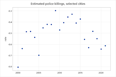
Then I fit two Poisson models with effects for year and place, one for "big cities" and one for other places.  The estimated year effects:


Since I am interested in comparing trends, not absolute rates, the 2000 rate is a baseline for each--below zero means that the rate is lower than it was in 2000, above zero means it's higher.  The rate in big cities  appears to have increased until about 2010 and declined since then; the rate in other places increased more substantially between about 2005 and 2015 and has been steady or declined since then.  In big cities, the latest (2022) rate is the same or a little lower than the 2000 rate; in other places, it's clearly higher.  

But the standard errors are pretty large, especially for other places, so I fit another model, with year effects plus a time trend/city size interaction.  That is, it says that there are short-term ups and downs that apply to both types of places, but also a gradual drift that differs between the two types.  The estimates:


Overall, the evidence is that the rate of killings by police in large cities has declined in the last decade or so, but the rate in smaller places has stayed the same or increased.  Why?  In a general sense, I think that it's because the rise in public concern with the issue has had more impact in larger cities.  Killings by police are more likely to happen in larger places (if only because the population is larger), and to get more media coverage (since newspapers and TV stations are located there), so the pressure to keep the numbers down is stronger.  How they actually accomplished it probably involves specific practices and training, and I don't know anything about policing, so I don't have any ideas.

The Lancet article that started me on these posts says:  "more recent reform efforts to prevent police violence in the USA, including body cameras, implicit bias training, de-escalation, and diversifying police forces, have all failed to further meaningfully reduce police violence rates.  As our analysis shows, fatal police violence rates and the large racial disparities in fatal police violence have remained largely unchanged or have increased since 1990."  There analysis actually showed that racial disparities had declined, but even apart from that, stability or increase in the overall rates doesn't mean that reforms have been ineffective:  it's possible that there are some factors that have worked to increase rates and others that have reduced them.  The fact that the rates have moved in different directions in different places suggests that is the case.  

PS:  On the same general subject, Peter Moskos has compiled data on fatal police shootings in 18 cities in the 1970s and the present.  It declined in 14, stayed about the same in three, and increased in two.  


Tuesday, May 9, 2023

Getting worse all the time, part 2

 The figures presented in my last post (taken from an article in The Lancet) indicated that killings by police increased between the 2000s and the 2010s, with the biggest increase occurring for non-Hispanic whites.  This post will take a closer look at that change.  There are several data sources--the National Vital Statistics System, based on death certificates, and two unofficial counts based on publicly available reports (mostly news stories)--Mapping Police Violence and Fatal Encounters.*  The counts from these sources:


Fatal Encounters started in 2000, but the coverage in the early years was less complete.  The Lancet article that I mentioned last time concludes that it has more or less complete coverage starting in 2005, so I just show those years in the figure.  All three series show upward trends, but the rate of increase differs.  Mapping Police Violence clearly doesn't increase as rapidly as the others.  The difference between Vital Statistics and Fatal Encounters is less obvious, but Vital Statistics shows a somewhat larger increase (between 2005 and 2021, deaths increased by 54% in Fatal Encounters and 85% in Vital Statistics).  I don't know why there might be a difference between FE and MPV, but my guess is that the recording became more complete in NVSS--that is, death certificates became more likely to note police involvement rather than just the physical cause of death--because the issue was getting more attention.  However, the fact that the MPV and FE counts also increased is evidence that there was a real change--it wasn't just more complete reporting.  

But there is one more source:  Justin Nix has compiled reports from about 400 police departments covering various periods of time ranging from 8 to 52 years.  I fit a model that included effects for department and year.  The estimates by year for the 2000-2020 period:


The pattern is completely different--an increase until about 2010, and then a decline.  How could you account for the difference?  Nix's data include only around 3% of all police departments in the country, but most of the biggest cities:  e. g., New York, Chicago, Philadelphia, LA, and Houston.  So maybe smaller places are behind the increase?

The NVSS data can be broken down by a classification of urbanism:


The increase was distinctly larger in "medium metro," "micropolitan," and "small metro" (definitions are here).  Back when this issue started to get attention, I recall reading that police departments had acquired a lot of new equipment as part of the "war on terror" or surplus from the Iraq war.  It seems likely that this would have had more impact on smaller police departments, might adopt more aggressive tactics as a result of having new capacity.  The fact that the increase was larger in smaller cities might also help to explain why it was larger among whites than among blacks--the white population is relatively larger in small and medium metro areas.  

In one of my previous posts on this subject, I mentioned the idea that state and local governments are "laboratories of democracy."  That suggests that they will compare experiences and adopt policies that work better.  But differences in rates and trends haven't received much attention in the debate on police killings.  On the progressive side, you get empty generalities like "the USA must replace militarised policing with evidenced-based support for communities, prioritise the safety of the public, and value Black lives" (the last sentence of the Lancet article); on the right, the issue gets dismissed as part of a "war on cops."

*The Washington Post compilation just involves deaths by shooting.  There's also a project called The Counted, but that only covers 2015 and 2016, so it's not useful for looking at trends.    

Wednesday, May 3, 2023

Getting worse all the time?

 A 2021 article in The Lancet combines data from several sources to get estimates of the number of people killed by police from the 1980s onward.  It summarizes: "as our analysis shows, fatal police violence rates and the large racial disparities in fatal police violence have remained largely unchanged or have increased since 1990."  Here's a table giving their estimates of age-standardized mortality rates per 100,000 for (non-Hispanic) blacks, Hispanics, and (non-Hispanic) whites:

                   Black     Hisp   White       All
1980s           .81          .44      .15          .25
1990s           .66          .35      .18          .25
2000s           .60          .32      .19          .26
2010s           .71          .34      .28          .34

So the overall rate has increased, but racial and ethnic disparities have declined--the black/white ratio was over 5 in the 1980s, then about 3.5, 3, and 2.5 in the following decades.  The Hispanic/white ratio was almost 3 in the 1980s and about 1.2 in the 2010s.  The numbers I give above aren't from a reanalysis of the data--they are taken straight from the paper.  And they were in a major table, not hidden away in a footnote or the supplemental materials.  So how did the authors make (and the reviewers miss) an obvious mistake in summarizing their results?  "Disparity" has a connotation of unfairness, so a reduction in disparity sounds like a good thing.  But in this case, things didn't get better--the rate for blacks and Hispanics stayed about the same, and the rate for whites got worse.  As a result, describing the changes as a "reduction in disparities" doesn't sound right, even though it is by the dictionary definition.  The term "disparities" seems to have become widely established in public health--I don't know when or how this happened--even when the data just involve differences (as is the case here).  

  Although they used four different data sets, only one (the National Vital Statistics System) went back before 2005.   Last August, I did an analysis of the NVSS data going back to 1960.    I mentioned that the NVSS data seemed to under-report the number of killings by police, and that the rate of under-reporting could change over time.  It seemed plausible that reporting would tend to become more complete, which would create the appearance of an increase even if there was no real change.  So has there really been an increase in the overall rate of police killings?  I'll look at that in my next post.