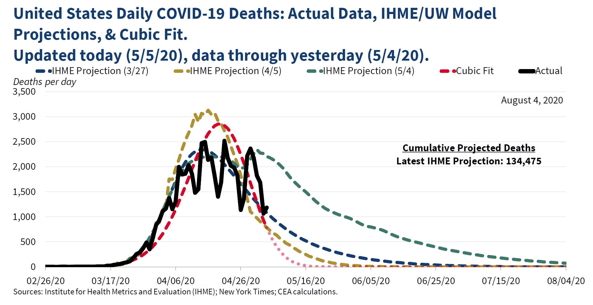
" To better visualize observed data, we also continually update a curve-fitting exercise to summarize COVID-19's observed trajectory. Particularly with irregular data, curve fitting can improve data visualization. As shown, IHME's mortality curves have matched the data fairly well."
The "cubic fit" was widely ridiculed at the time. Jason Furman, who was chair of the Council under Obama, said that it "might be the lowest point in the 74 year history of the council," and Paul Krugman wrote a column suggesting that Kevin Hassett, who developed the cubic fit model, had a history "of both being wrong at every important juncture and refusing to admit or learn from mistakes."
The chair of the council, Tomas Philipson, replied "past CEA Chair Furman (and economist turned political hack Krugman) not understanding the difference between data smoothing and model-based forecasting. Furman only chair without peer-reviewed scientific work and academic appointments-it shows." He wasn't done. His next tweet was restrained: "Kevin Hassett’s work comparing existing model-based forecasts with the emerging data should seem sensible to anyone interested in understanding the future course of the pandemic," but he was soon back on the attack: “comparing things to the data might have helped Furman when he advised the worst economic recovery in history.”
The cubic fit got renewed attention yesterday when a number of people pointed out that it suggested we should be down around zero deaths now, which obviously we aren't (1491 on May 15, according to data published in the Washington Post). But suppose we give the Council the benefit of the doubt and assume that they never intended the cubic model to be a forecast. What would be the point of doing it, then? I think the clue is in the last sentence "IMHE's mortality curves have matched the data fairly well." There are three different curves, one from March 27, one from April 5, and one from May 4. The first two are similar, showing a peak in mid-April and then a rapid decline. The second has a higher peak, but a more rapid decline. It predicts about 150-200 deaths a day in mid-May. The first one predicts about 500 in mid-may, and both predict near zero by late June. The last IMHE projection is quite different, and more pessimistic, predicting about 1,500 in mid-May, and about 500 in late June.
So my guess is that the Council was concerned about the May 4 projections--they wanted to believe that the March and April ones were more reliable. And by this point, a pattern of sharp rises and falls had developed, with lower rates on Saturday and Sunday. Just looking at different projections compared to the data, it wasn't obvious which one was better--for example, the May prediction was right on target for late April, but far above the actual numbers on May 4; the March and April projections were far below the actual numbers in late April, but right on target for May 4. Therefore, it seemed reasonable to smooth the data and see which of the projections fit it best. Looking at the figure in the tweet, it appears that the "smoothed" data matches the April 5 projection pretty closely. So I think that the message of the tweet (and presumably what the CEA believed) was that we should accept the two earlier projections, not the latest one--that deaths would decline pretty rapidly.
I used the Washington Post data on coronavirus deaths to estimate a cubic polynomial with powers of time as independent variables.* The results are very similar to those in the CEA tweet:

But why a cubic polynomial? There is no prior reason to assume that will provide the best fit, so you have to consider different orders of polynomials and pick the best one. The usual practice is to start at the "bottom" and keep adding terms (squared, cubed, fourth, fifth, etc. powers) as long as they are statistically significant. An alternative, and probably better, approach is to start with some high-degree polynomial and remove the highest powers one by one until the highest remaining one is statistically significant. I took the conventional approach and added a fourth power, which was statistically significant (t-ratio of 5.9), and then a fifth power, which was not. So the final ("quartic") model included fourth, third, squared, and linear terms. The estimates:

The quartic fit is clearly better, and it's more like the May 4 projection in that it has a slower decline from the peak. In case you're wondering what happens if the quartic model is projected to May 15:

That's why you're not supposed to use polynomial regressions for prediction.
To conclude, it was reasonable to do some smoothing of the data, especially since the daily counts probably represent when the paperwork was filed rather than the actual time of deaths (it's hard to see why actual death rates would be lower on weekends). Not everyone thinks that polynomial regressions are a good way to do that, but they are a well established method. But if you're going to use polynomial regressions, you have to make some effort to pick the right order--otherwise, why not just save trouble and fit a linear regression? So even if the curve-fitting exercise was done for "data visualization" or smoothing rather than prediction, it was done badly.
*Since deaths can't be negative, I estimated the logarithm of deaths and then transformed the predicted values from the regressions. I started the clock at March 1--it looks like the CEA started a few days before then.
No comments:
Post a Comment