I located the questions on limiting executive salaries that I mentioned the other day:
March 2009 (Fox News/Opinion Dynamics) Do you think the federal government should ever be allowed to
regulate the salaries of corporate executives at American companies? 38% yes, 56% no
March 2009 (Quinnipiac) Do you think the government should limit the amount of money that companies not taking federal funds pay their executives? 30% yes, 64% no
Both of those were coupled with questions about pay at companies that were taking money from the government--for those 64% favored regulation in the Fox poll, 81% favored limits in the Quinnipiac. I think that "regulation" sounds weaker than "limit," so I'm not sure why support for "regulation" of salaries in "companies that take taxpayer bailouts" (their words) was lower in the Fox poll than support for "limit" in companies that were "taking federal funds" was in the Quinnipiac. I don't know about the order in which the questions were asked in either poll, but that might be the explanation--if people had said no to the general question, they might be less likely to say yes to the specific one. However, support for the general principle of regulating/limiting salaries was comparable.
There is also:
(Gallup) Do you favor or oppose the federal government taking steps to limit the pay of executives at major companies?
Favor Oppose
June 2009 59% 35%
March 2018 47% 48%
"Taking steps" sounds weaker than "limit" or even "regulation," so I'm not surprised that support was higher. The drop in support between 2009 and 2018 is interesting.
The general point is that even though large majorities think executive salaries are too high (I think I've had some posts documenting that), there's much less support for government action to do something about it.
Saturday, May 30, 2020
Thursday, May 28, 2020
Salary limits
In 1939, a Roper/Fortune survey asked:
"Do you think there should be a law limiting the amount of money any individual is allowed to earn in a year?" 24% said yes, 70% no
In 1943, the Office of Public Opinion Research asked "When the war is over, do you think it would be a good idea or a bad idea for us to have a top limit on the amount of money any one person can get in a year?" 40% said yes, and 51% said no.
In 1946, the Opinion Research Corporation asked "Do you think it would be a good thing for the country if the government put a top limit on the salary any man could make?" They repeated that in 1953, twice in 1955, and 1961 with the following results:
Yes No
1946 32% 62%
1953 17% 78%
1955 17% 78%
1955 15% 81%
1961 21% 68%
[1962 21% 68%]*
In 1981 a survey by Civic Services (an organization I hadn't heard of before), asked people about this statement: "There should be a top limit on incomes so that no one can earn more than $100,000 a year." 20% agreed and 75% disagreed
In 1994, a survey by Reader's Digest and the Institute for Social Inquiry asked " Should there be a top limit on incomes so that no one can earn more than one million dollars a year?" 22% said yes, and 74% said no.
Oddly, no similar question seems to have been asked since then, despite growing concern with inequality. But it seems that support was quite steady at about 20%, except for the increase during and right after the war. I doubt that the exact numbers in the last two questions mattered much, since but $100,000 in 1981 would be about $300,000 today, and $1,000,000 in 1994 would be about 1.75 million.
There have been a few questions about limiting salaries in particular occupations. In 1991, a CBS News poll asked "Do you think there should be a limit on how much professional baseball players can earn in a year, or should baseball players be allowed to earn as much as team owners are willing to pay them" 49% said yes, 47% no
In 2009 a CBS News poll asked "Do you think the federal government should put a limit on the amount of money that senior executives can earn at financial institutions, or do you think this is something the federal government should not be involved in?" 46% said yes, 46% said shouldn't be involved.
I thought there was also one about CEOs in general, but I can't locate it now.
*I think this is just a duplicate listing of the 1961 survey.
[Data from the Roper Center for Public Opinion Research]
Thursday, May 21, 2020
Footnote 2
In a post about the claim of rising "despair" among less educated people, I noted that when asked "Some people say that people get ahead by their own hard work; others say that lucky breaks or help from other people are more important. Which do you think is most important?" people without a college degree had become more likely to say "hard work" while college graduates had become more likely to say "lucky breaks or help." I interpreted the changes among less educated people as counting against the hypothesis of rising despair, on the grounds that "hard work" was the optimistic answer. But Tom VanHeuvelen has suggested a different interpretation: "If you attribute success and failure mostly to your own efforts, well, then what do you make of life when the massive structural factors out of your control . . . all hit you in a span of two decades? It certainly feels like a depressing and mortifying combination of factors." The implication is that if a people think that success is due to hard work, when when things get worse they will blame themselves. This sounds plausible, and in fact I think some noted sociologist or political scientist said that this was one of the reasons for the relative lack of "class consciousness" in the United States. On the other hand, my interpretation also seems plausible, at least to me.
To try to see which interpretation fits here, I looked at the correlation between views on the sources of success and happiness. On the average, people who say that success is due to hard work are happier than those who say it's due to breaks or help. It seems to me that VanHeuvelen's interpretation suggests that this relationship should differ by social position: it will be reversed, or at least weaker, among people in lower social positions. That is, if you think that getting ahead is the result of hard work, and you haven't gotten ahead, then you'll feel bad about yourself. On the other side, people who have been successful and think that success is the result of hard work will enjoy not just the material benefits of success, but greater self-esteem.
Breaking it down by education
Correlation
Not HS grad .11
HS grad .09
College grad .09
By occupational prestige
Low (1-30) .09
Medium low (30-40) .05
Medium (40-50) .05
Medium high (50-60) .09
High (60+) .06
There is no apparent pattern in the group differences, and they are small enough to be ascribed to sampling variation. That is, it seems like the relationship is pretty much the same at all social levels: people who think that getting ahead is the result of hard work are happier, even if by conventional standards they have not gotten ahead themselves. It could be that people who think that getting ahead is due to hard work believe that they will get ahead in the future. Or people may be able to see themselves as having done pretty well by their own standards--compared to some other people they've known, or considering the problems they've faced.
I restricted this analysis to whites, since the "despair" arguments focus on them. But I thought a comparison of races might be interesting:
Corr
White .09
Black .03
Other .07
The black-white difference is statistically significant. I don't have an interpretation for it, but it seems worth thinking about. As far as the relationship between race and views on getting ahead, blacks are a bit more likely to say lucky breaks or help.
Monday, May 18, 2020
Footnote
The New Yorker has an article called "How Greenwich Republicans Learned to Love Trump." It deals with an important issue--how Trump has maintained a high level of support among Republicans, even the kind of Republicans who once had doubts about him--but there's another important issue that it just mentions in passing, which is that there aren't as many Greenwich Republicans as there used to be. Greenwich was once solidly Republican--Lyndon Johnson won in 1964, but no other Democrat even broke 40% until Bill Clinton in 1996. But Barack Obama won the town in 2008, and Hillary Clinton won it by a larger margin in 2016. I calculated the difference between vote in Greenwich and the national vote. For example, in 1948 Truman got 29.8% of the vote in Greenwich and Dewey got 68.9%; in the nation, Truman got 49.6% and Dewey got 45.1%. The difference is (29.8-68.9)-(49.6-45.1)= -43.6. The difference from 1948 to 2016:

The shift towards the Democrats is pretty steady. There are a few unusual elections. One is 1964, when a lot of places broke from their traditional voting patterns. Another is 2012, when the Democratic vote in Greenwich fell off sharply from 2008 (53.4% to 43.9%). My guess is that was because of financial regulation and other measures that Obama took to deal with the recession--although a lot of people on the left saw Obama as a "neoliberal" who was serving the interests of finance, the finance industry didn't see him that way. Finally, there was 2016, when Clinton was ahead of the trend. But those are all secondary--the big story is just the general movement towards the Democrats.
I also remembered a post from last year, where I predicted the 2016 vote in Connecticut towns from two variables--population density and the ratio of mean to median household income. I was primarily concerned with the urban/rural differences, and just found the mean/median relationship by experimentation. But when I thought about it again, I decided I should control for racial composition as well. That reduces the estimated effect of population density, but leaves the estimated effect of mean/median income almost unchanged. In a post from earlier this year, I found that income inequality, particularly at the top end, is associated with more Democratic support at the county level. That is the case among Connecticut towns as well. Greenwich is an outlier here--it has the second mean/median ratio among Connecticut towns, so it's predicted to be near the top in Democratic support, but is actually in the middle.
Saturday, May 16, 2020
What were they thinking?
On May 5, the Council of Economic Advisers sent out a tweet that got a lot of attention:
" To better visualize observed data, we also continually update a curve-fitting exercise to summarize COVID-19's observed trajectory. Particularly with irregular data, curve fitting can improve data visualization. As shown, IHME's mortality curves have matched the data fairly well."
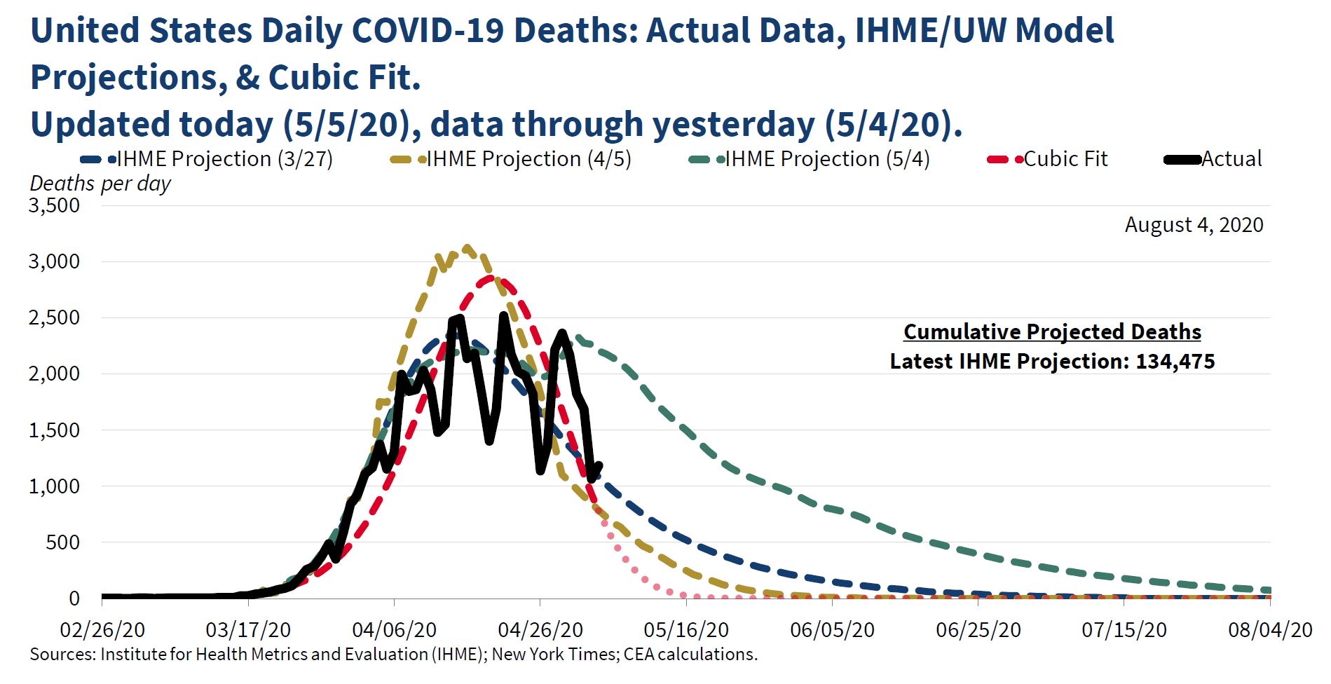
The "cubic fit" was widely ridiculed at the time. Jason Furman, who was chair of the Council under Obama, said that it "might be the lowest point in the 74 year history of the council," and Paul Krugman wrote a column suggesting that Kevin Hassett, who developed the cubic fit model, had a history "of both being wrong at every important juncture and refusing to admit or learn from mistakes."
The chair of the council, Tomas Philipson, replied "past CEA Chair Furman (and economist turned political hack Krugman) not understanding the difference between data smoothing and model-based forecasting. Furman only chair without peer-reviewed scientific work and academic appointments-it shows." He wasn't done. His next tweet was restrained: "Kevin Hassett’s work comparing existing model-based forecasts with the emerging data should seem sensible to anyone interested in understanding the future course of the pandemic," but he was soon back on the attack: “comparing things to the data might have helped Furman when he advised the worst economic recovery in history.”
The cubic fit got renewed attention yesterday when a number of people pointed out that it suggested we should be down around zero deaths now, which obviously we aren't (1491 on May 15, according to data published in the Washington Post). But suppose we give the Council the benefit of the doubt and assume that they never intended the cubic model to be a forecast. What would be the point of doing it, then? I think the clue is in the last sentence "IMHE's mortality curves have matched the data fairly well." There are three different curves, one from March 27, one from April 5, and one from May 4. The first two are similar, showing a peak in mid-April and then a rapid decline. The second has a higher peak, but a more rapid decline. It predicts about 150-200 deaths a day in mid-May. The first one predicts about 500 in mid-may, and both predict near zero by late June. The last IMHE projection is quite different, and more pessimistic, predicting about 1,500 in mid-May, and about 500 in late June.
So my guess is that the Council was concerned about the May 4 projections--they wanted to believe that the March and April ones were more reliable. And by this point, a pattern of sharp rises and falls had developed, with lower rates on Saturday and Sunday. Just looking at different projections compared to the data, it wasn't obvious which one was better--for example, the May prediction was right on target for late April, but far above the actual numbers on May 4; the March and April projections were far below the actual numbers in late April, but right on target for May 4. Therefore, it seemed reasonable to smooth the data and see which of the projections fit it best. Looking at the figure in the tweet, it appears that the "smoothed" data matches the April 5 projection pretty closely. So I think that the message of the tweet (and presumably what the CEA believed) was that we should accept the two earlier projections, not the latest one--that deaths would decline pretty rapidly.
I used the Washington Post data on coronavirus deaths to estimate a cubic polynomial with powers of time as independent variables.* The results are very similar to those in the CEA tweet:

But why a cubic polynomial? There is no prior reason to assume that will provide the best fit, so you have to consider different orders of polynomials and pick the best one. The usual practice is to start at the "bottom" and keep adding terms (squared, cubed, fourth, fifth, etc. powers) as long as they are statistically significant. An alternative, and probably better, approach is to start with some high-degree polynomial and remove the highest powers one by one until the highest remaining one is statistically significant. I took the conventional approach and added a fourth power, which was statistically significant (t-ratio of 5.9), and then a fifth power, which was not. So the final ("quartic") model included fourth, third, squared, and linear terms. The estimates:

The quartic fit is clearly better, and it's more like the May 4 projection in that it has a slower decline from the peak. In case you're wondering what happens if the quartic model is projected to May 15:

That's why you're not supposed to use polynomial regressions for prediction.
To conclude, it was reasonable to do some smoothing of the data, especially since the daily counts probably represent when the paperwork was filed rather than the actual time of deaths (it's hard to see why actual death rates would be lower on weekends). Not everyone thinks that polynomial regressions are a good way to do that, but they are a well established method. But if you're going to use polynomial regressions, you have to make some effort to pick the right order--otherwise, why not just save trouble and fit a linear regression? So even if the curve-fitting exercise was done for "data visualization" or smoothing rather than prediction, it was done badly.
*Since deaths can't be negative, I estimated the logarithm of deaths and then transformed the predicted values from the regressions. I started the clock at March 1--it looks like the CEA started a few days before then.
" To better visualize observed data, we also continually update a curve-fitting exercise to summarize COVID-19's observed trajectory. Particularly with irregular data, curve fitting can improve data visualization. As shown, IHME's mortality curves have matched the data fairly well."
The "cubic fit" was widely ridiculed at the time. Jason Furman, who was chair of the Council under Obama, said that it "might be the lowest point in the 74 year history of the council," and Paul Krugman wrote a column suggesting that Kevin Hassett, who developed the cubic fit model, had a history "of both being wrong at every important juncture and refusing to admit or learn from mistakes."
The chair of the council, Tomas Philipson, replied "past CEA Chair Furman (and economist turned political hack Krugman) not understanding the difference between data smoothing and model-based forecasting. Furman only chair without peer-reviewed scientific work and academic appointments-it shows." He wasn't done. His next tweet was restrained: "Kevin Hassett’s work comparing existing model-based forecasts with the emerging data should seem sensible to anyone interested in understanding the future course of the pandemic," but he was soon back on the attack: “comparing things to the data might have helped Furman when he advised the worst economic recovery in history.”
The cubic fit got renewed attention yesterday when a number of people pointed out that it suggested we should be down around zero deaths now, which obviously we aren't (1491 on May 15, according to data published in the Washington Post). But suppose we give the Council the benefit of the doubt and assume that they never intended the cubic model to be a forecast. What would be the point of doing it, then? I think the clue is in the last sentence "IMHE's mortality curves have matched the data fairly well." There are three different curves, one from March 27, one from April 5, and one from May 4. The first two are similar, showing a peak in mid-April and then a rapid decline. The second has a higher peak, but a more rapid decline. It predicts about 150-200 deaths a day in mid-May. The first one predicts about 500 in mid-may, and both predict near zero by late June. The last IMHE projection is quite different, and more pessimistic, predicting about 1,500 in mid-May, and about 500 in late June.
So my guess is that the Council was concerned about the May 4 projections--they wanted to believe that the March and April ones were more reliable. And by this point, a pattern of sharp rises and falls had developed, with lower rates on Saturday and Sunday. Just looking at different projections compared to the data, it wasn't obvious which one was better--for example, the May prediction was right on target for late April, but far above the actual numbers on May 4; the March and April projections were far below the actual numbers in late April, but right on target for May 4. Therefore, it seemed reasonable to smooth the data and see which of the projections fit it best. Looking at the figure in the tweet, it appears that the "smoothed" data matches the April 5 projection pretty closely. So I think that the message of the tweet (and presumably what the CEA believed) was that we should accept the two earlier projections, not the latest one--that deaths would decline pretty rapidly.
I used the Washington Post data on coronavirus deaths to estimate a cubic polynomial with powers of time as independent variables.* The results are very similar to those in the CEA tweet:
But why a cubic polynomial? There is no prior reason to assume that will provide the best fit, so you have to consider different orders of polynomials and pick the best one. The usual practice is to start at the "bottom" and keep adding terms (squared, cubed, fourth, fifth, etc. powers) as long as they are statistically significant. An alternative, and probably better, approach is to start with some high-degree polynomial and remove the highest powers one by one until the highest remaining one is statistically significant. I took the conventional approach and added a fourth power, which was statistically significant (t-ratio of 5.9), and then a fifth power, which was not. So the final ("quartic") model included fourth, third, squared, and linear terms. The estimates:
The quartic fit is clearly better, and it's more like the May 4 projection in that it has a slower decline from the peak. In case you're wondering what happens if the quartic model is projected to May 15:
That's why you're not supposed to use polynomial regressions for prediction.
To conclude, it was reasonable to do some smoothing of the data, especially since the daily counts probably represent when the paperwork was filed rather than the actual time of deaths (it's hard to see why actual death rates would be lower on weekends). Not everyone thinks that polynomial regressions are a good way to do that, but they are a well established method. But if you're going to use polynomial regressions, you have to make some effort to pick the right order--otherwise, why not just save trouble and fit a linear regression? So even if the curve-fitting exercise was done for "data visualization" or smoothing rather than prediction, it was done badly.
*Since deaths can't be negative, I estimated the logarithm of deaths and then transformed the predicted values from the regressions. I started the clock at March 1--it looks like the CEA started a few days before then.
Sunday, May 10, 2020
Death, status, and party
When I was writing my recent posts on the alleged rise of "despair" I recalled that a recent paper by Siddiqi, So-Erdene, Hamilton, Cottom, and Darity found a correlation between changes in county-level white mortality rates and Republican voting in 2000-16: places in which mortality rates increased shifted towards the Republicans. Their interpretation was that both early deaths and Republican support reflect rising perceived "status threat."* Oddly, they didn't consider an alternative interpretation, which is that changes in voting were influenced by changes in actual conditions. A large part of the rise in premature mortality involves deaths from drugs. It seems plausible that a rise in drug abuse would cause people to turn to the right, partly because people often react to social disorder by supporting "get tough" policies, and partly because they can blame drug users for bringing problems on themselves.
In doing my post on "deaths of despair," I had noticed that, although drug-related deaths have increased pretty steadily over the last 50+ years, the rate of increase was unusually large in 2012-16, going from 11.7 to 18.4 per 100,000. I had county-level data on votes and some other control variables in 2012 and 2016, so I added changes in drug related deaths. The CDC does not report the exact number unless it is 10 or larger, so I omitted counties in with fewer than 10 in both 2012 and 2016--this eliminated most counties, bringing it down from over 3,000 to a little over 900. For counties that had fewer than 10 in one year, I used 5 as the estimate for that year. From that point, I computed the change in deaths per 100,000 and included it as an independent variable. The estimates from one model (I experimented with different controls and the estimate for drug deaths was quite stable):
Term Est SE t-ratio
Constant 0.400 0.0243 16.46
% Rep 2012 0.922 0.0114 81.13
% income under 10K -0.163 0.0584 -2.80
% income over 150K -0.356 0.0324 -10.97
Change drug deaths 0.075 0.0105 7.12
log population -5.93 0.380 -15.60
The 25th percentile for changes in drug deaths is about 1.5 (per 100,000), the 75th percentile is about 15, and the 95th percentile is about 28. So going from the 25th to 75th percentile would increase the expected Republican share by about 1%--going to the 95th by about 2%. Of course, the counties aren't independent cases. I didn't have time to do a sophisticated control for spatial correlated errors, but I did a crude and probably excessive one: adding dummy variables for each state. The estimated effect of drug deaths was only about a third as large, but still statistically significant.
My analysis here doesn't refute the "status threat" interpretation--it's just meant to show that there's an alternative interpretation of the connection between changes in death rates and changes in voting patterns that has some promise. I've had other posts arguing that the status threat idea doesn't fit the general pattern of changes in public opinion--particularly the recent shifts to the left on immigration and racial attitudes.
*I was reminded of it by this blog post, which offers a different critique.
Thursday, May 7, 2020
Votes of despair?
A few days ago, the New York Times had an article that mentioned "the despair in parts of rural America that helped fuel the rise of a figure like Mr. Trump." That led me to wonder if Trump had any special appeal to people who were in "despair." The General Social Survey has a question on happiness: "Taken all together, how would you say things are these days - would you say that you are very happy, pretty happy, or not too happy?" I ran logistic regressions of the choice between Democratic and Republican candidates and voting vs. not voting on happiness in presidential elections from 1972-2016 (omitting blacks, since they voted heavily Democratic in all elections). The results:
 In every election, people who were happier were more likely to vote, and if they did vote, were more likely to vote Republican. The estimated vote-happiness relationship was larger in 2016 than in any other election, and the estimated party-happiness relationship was stronger than average (3d out of twelve elections). The variations are small enough so that they might the the result of chance, so I wouldn't put too much stock in the rankings. However, there's certainly no evidence that Trump had a particularly strong appeal to unhappy people.
So why is this idea that Trump appealed to people who were discontented widely accepted? The article I mentioned was a news story, not an opinion piece, and it treated the link between despair and Trump as a fact, not a hypothesis. One factor is that it's widely known that conditions of life for people without a college degree have been declining, and that white people without a college degree voted strongly for Trump. Putting those together, it seems reasonable that people without a college degree have been growing more discontented, and that helps to explain their votes. But as I've mentioned in several recent posts, while there's been some increase in discontent, it hasn't been very strong. Another reason is that people who write about politics tend to forget that a lot of people don't vote, and that in the "lower" classes, however you define them, most people don't vote. In another recent piece in the NY Times, Arlie Russell Hochschild says "faced with a coal miner suffering black lung disease, or a laid-off factory hand, liberals feel compassion. Faced, on the other hand, with a man in cowboy boots and red MAGA hat, arms defiantly folded, who dismisses climate science and insults overeducated 'snowflakes,' many see — and hate — 'the enemy.'
Yet what if these are one and the same man?"
Of course, they could be, but it's more likely that the disabled coal miner or laid-off factory hand didn't vote, doesn't pay much attention to politics, and that his most deeply held opinion is that you can't trust any of them.
Monday, May 4, 2020
Class conflict?
Some people have said that the coronavirus epidemic will bring Americans together, uniting us behind a goal that transcends political differences. It doesn't seem to be working out that way--whether to ease restrictions has become a political issue, with Republicans more in favor of a quick end and Democrats more in favor of keeping restrictions. There have been some claims that it's also a class issue. The more common version is that the "elites" can work at home, so they are happy to keep going on that way, but most ordinary people can't, so they want to get back to work (see this article for an entertainingly unhinged example). But you could also argue it the other way--affluent people are getting fed up with online meetings, and tend to have jobs that would let them keep more space from their co-workers, so they want to get back to normal; less affluent people have jobs that would expose them to infection, so they want to stay safe. I couldn't find individual-level data for any survey, but I did find one report that breaks opinions down by some demographic variables.
The most relevant question is "Do you think current restrictions on how restaurants, stores and other businesses operate in your state are appropriate, are too restrictive or are they not restrictive enough?"
Too restrictive Appropriate Not enough
Republicans 29% 60% 11%
Democrats 8% 72% 19%
Although majorities of both parties say (or said--the survey was April 21-26) they were appropriate, there is a pretty big difference.
By education:
College grads 15% 72% 12%
Others 18% 63% 18%
or restricting it to whites:
College grads 17% 72% 10%
Others 20% 64% 15%
To the extent there is a difference, it's that less educated people are more likely to have "extreme" opinions of both kinds. Maybe that's because more educated people tend to have more trust in the authorities. But basically, it's not a major factor.
A few other variables: income is similar to education, with lower income people more likely to take both "extreme" positions; non-whites, women, and younger people more likely to say "not restrictive enough" and less likely to say "too restrictive". All of those differences are considerably smaller than the party differences. Region and urban/rural residence seem relevant in principle, but aren't included in the report.
Subscribe to:
Posts (Atom)