Wednesday, July 31, 2024

Left behind?, part 2

 After I finished my last post, it occurred to me that if people in rural areas felt "left behind," that should lead to a decline of confidence in institutions.  The General Social Survey has a series of questions about confidence in "the people running" various institutions.  For most of them, there's been a long-term decline (see this post):  the question I'll consider here is whether that decline has been larger in rural areas.  By and large, it has:  taking the twelve that have been asked about since the 1970s, the median correlation of confidence with time is -.115 for people living in MSAs, -.15 for people living in "other urban" counties, and -.18 for people living in rural areas.  Two of them stood out as especially large gaps:  medicine and education.  The figures show means by place of residence over time:


There's a lot of sampling variation in the individual years, so I include smoothed estimates.  Their exact shape should not be taken too seriously, but it's clear that in the 1970s and 1980s confidence in education was generally higher in rural areas and "other urban" than in MSAs, and in recent years the difference has disappeared.  


In the 1970s, confidence in medicine was higher in towns and rural areas than in MSAs:  now it is lower.  

Why would those two institutions show a particularly large decline in confidence in rural areas?  One possibility is that it's part of a general decline in trust in science and experts, maybe because they are all seen as part of a distant elite.  However, there's also a question about confidence in "the scientific community," and the trends for that are about the same in all types of places.  That suggests that the explanation is something specific to medicine and education.

There has been a trend towards geographic concentration of medical services, so people in rural areas are less likely to have medical providers in the community or nearby.  This could help to explain the relative decline in confidence.  For education, there was also a process of consolidation as small school districts were merged into larger districts.  That is, people in rural areas didn't have as much connection to and control of the schools as they previously had.  Although most of the consolidation took place in the 1950s and 1960s, the regional schools started with the teachers and administrators who had been in the local schools, so it may have taken a while for perceptions to change.  


The GSS also had a question on how much satisfaction you get from "the city or place you live in."  Unfortunately, they dropped the question in the mid-1990s, but there's a striking trend in the years before then.  In the 1970s, people in rural areas were substantially more satisfied than people in MSAs; that advantage was gone by the 1990s.  Hopefully, there are questions that are similar enough to take the story up to the present:  if I find any, I'll talk about them in a future post.


Saturday, July 27, 2024

Left Behind?

 A few weeks ago, the New York Times had an article on rising support for the National Rally in rural France, which it said was due to a feeling of being neglected by the national government:  "Residents in this sparsely populated region ... - describe what is happening to their community as 'desertification,' by which they mean an emptying out of services, and of their lives."  Rural areas in the United States are also moving to the right, and people often give a similar explanation--they are "left behind" by changes in the economy, think the government isn't interested in their problems, and in some accounts resent the places and groups that seem to be moving ahead of them.  Economic growth has clearly been lagging in many small towns and rural areas, but I haven't seen much information about changes in political views, so I'll look at that issue in this post.  

The General Social Survey classifies places into six groups:  central city of the twelve largest metropolitan statistical areas, suburbs of the 12 largest MSAs, central city of the 13-100 MSAs, suburbs of the 13-100 MSAs, counties with towns of 10,000 or more, and counties without towns of 10,000 or more.  I combined the first four, so that there are three groups.  Then I calculated the correlation between year and opinions for each question.*  I'll start with two general measures of political orientation:  self-rating as liberal, moderate, or conservative; and whether the government is trying to do too many things that should be left to individuals and private business.  Each is coded so that a positive correlation means that opinions have tended to move in a liberal direction since the question was first asked (in the 1970s).

                          MSA     Town      Rural

POLVIEWS       .00        -.05         -.07
HELPNOT         .01        -.01         -.07

So urban areas have stayed about the same, while rural areas have become more conservative on both (generally, differences of about .03 or more are statistically significant).  

Now a few "social issues," again with positive signs meaning liberal trends:  legal abortion, whether sex between two adults of the same sex is wrong, whether there should be prayer in public schools, and whether a police permit should be required in order to buy a gun:

                             MSA     Town      Rural

ABSINGLE           -.05       -.05        -.03
HOMOSEX            .37        .32          .32
PRAYER                .07        .02          .01
GUNLAW             -.03        -.03        -.06

Rural areas have become more conservative relative to MSAs on three of the four.

Now some opinions related to race and ethnicity:  whether racial inequality is mostly due to discrimination against blacks, whether it's because blacks don't have the motivation and will power to get ahead, and whether the number of immigrants should be increased or reduced.  Again, a positive sign means a liberal trend:

                              MSA           Town         Rural
RACDIF1                 .06              .04            -.06
RACDIF4                 .22              .15              .17
LETIN1A                  .18              .15             .21

Rural areas have become relatively more conservative on the two questions about race, but there's no clear difference on immigration (that question has been asked only since the 1990s, so the standard errors are larger).

Now some questions about government spending on various issues.   Positive numbers mean a trend towards support for more spending.  There are a lot of questions, so I won't list them all, just talk about the general pattern and some notable cases.

                             MSA    Town    Rural

Nataid                .15  .10         .07
Natpark                .01  .05         .03
Natarms                .01  .05         .12
Natroad                .09  .08         .07
Nateduc                .13  .15         .16
Natrace                .14  .10         .09
Natheal                .00  .01         .06
Natenvir                .02  .01         .04
Natcity               -.02  .02         .05
Natmass                .05  .04         .10
Natfare                .11  .08         .06
Natsoc                .03  .05         .09
Natfarey                .06  .01         .05
Natspac                .19  .18         .22

Almost all of the trends are positive (towards favoring more spending)--the 1970s were a time of backlash against government spending.  The average across the questions is about the same for all groups, but there are some differences for individual items.  The upward trend is stronger in rural areas for spending on defense and the military (NATARMS), and weaker for foreign aid (NATAID), spending to help blacks (NATRACE), and welfare (NATFARE).  So far, it's a relative conservative shift in rural areas.  But the upward trend is also stronger for social security (NATSOC), health care (NATHEAL), mass transity (NATMASS), and even "solving the problems of big cities" (NATCITY).  

Finally, there's a question on the amount of federal income taxes you pay.  A positive number means that it's too low or about right rather than too high.

                              MSA       Town      Rural

TAX                       .06            .04          -.01

People in MSAs have been getting more satisfied (or less dissatisfied) and people in rural areas have stayed about the same.  That is, although people in rural areas have become more favorable towards spending on a lot of things, they haven't become more willing to accept taxes.

Overall, the movement in rural areas hasn't been a straightforward conservative one.   The spending questions suggest that people in rural areas have moved towards wanting the government to do more for Americans in general, but not for blacks specifically, and not for foreign nations.  There doesn't seem to be growing resentment against cities--if anything, it's diminished (see NATCITY and NATMASS).  And although rural areas have become relatively more conservative on race (NATBLACK, RACDIF1, RACDIF4), they haven't generally turned against "outsiders" (see LETIN1A).  


*I limited the analysis to whites.

Monday, July 15, 2024

The elites vs. the public?

A negative view of "elites" has become a central part of American conservatism.  It was always present to some degree, but it used to be focused on specific groups, especially journalists and intellectuals.  Now it's become a more general vision of a "deep state," "blob," or "uniparty."  In some versions, the elite has left-wing views and despises ordinary Americans--I wrote about one example a few weeks ago.  But there's also another version, which doesn't see the difference purely in terms of left and right, and where the elite is just not very aware of the public.   According to Oren Cass, the underlying problem in America is "elites who remain fully committed to their own preferences, to pulling the levers of power for their own benefit and to offering candidates in both parties who would preserve the status quo."  By "candidates in both parties" he doesn't mean Biden and Trump, but Biden and Nikki Haley--Trump represents the people, although he does that "imperfectly."  Although Cass doesn't offer any data on elite opinion, he is right in suggesting that Trump appeals to some views that are popular in the public but not among elites.  


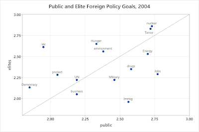
The figure is from a Chicago Council on Foreign Relations (Chicago Council on Global Affairs) survey that asked people and members of "foreign policy elites" to rank the importance of various possible foreign policy goals (1-3, higher means more important).  The ones below the diagonal line were ranked higher by the public than by elites; the ones above the line were ranked higher by elites.   The biggest gaps are for "helping to improve the standard of living of less developed nations" (ranked higher by elites), "controlling and reducing illegal immigration" (ranked higher by the public), and "protecting the jobs of American workers" (ranked higher by the public).  


Here is the corresponding figure for 2016.  The question on improving the standard of living wasn't included in this survey, but illegal immigration and jobs were, and again they were ranked more important by the public.  The 2016 survey added a question on "attaining US energy independence," which was ranked higher by the public (the 2004 survey had a question on "securing adequate supplies of energy, which was also ranked higher by the public).  The biggest gap in the other direction was "limiting climate change"--that question wasn't in the 2004 survey, but "improving the global environment" was ranked higher by elites in both surveys.  Compared to the general public, elites also placed a higher priority on "defending our allies' security."

So there are large and persisting gaps between elite and public opinion, and the goals which the public ranks more highly are ones that Trump has emphasized.  Cass says that  "leaders might seek to shape public opinion and alter preferences — indeed, that is part of leading — but they must yield to the outcome. Their obligation is to pursue the community’s priorities, not their own." The problem with this principle is that different potential goals are not independent of each other--people think protecting American jobs is important, but it's safe to say that they also think that having low prices is important.  On the other hand, sometimes goals are complementary--for example, a higher standard of living in less developed countries might reduce illegal immigration.   So if elites don't follow public opinion on specific policies, it's not necessarily because they are thinking about their own benefit:  it could be because they think they have a better understanding of how to achieve "the community's priorities," as they understand them.  Of course, those beliefs could be wrong, and Cass suggests they are:  his essay is called "This is what elite failure looks like."  Many other observers have offered similar accounts:  the idea is that decades of policy failures led to popular discontent and a revolt against the elites.  But have elites actually done so badly?  I'll look at that question in a future post.  


Monday, July 8, 2024

Vice-precedented

Since becoming vice-president, Kamala Harris hasn't been very popular with the public--but how much of that is the result of her own qualities, and how much is because she has served with a president who hasn't been very popular?  I looked for data on approval ratings of previous vice-presidents.  For this analysis, I just used a single observation for each one--if Joe Biden decides to step aside, I may include more.  I tried to use approval ratings at about this point in the term (fourth year of the first term), but questions on vice-presidential approval haven't been asked all that often, so I couldn't follow that closely.   The figure shows net approval ratings (approve minus disapprove) for the vice-president and president.*

There is an association--if the president has a good approval rating, the vice-president is likely to have one too.  A regression of vice-presidential approval on presidential approval gives:
VP=9.8+0.64P; t-ratios are 2.6 and 3.2.  Three vice-presidents are substantially below the predicted values--Harris, Dick Cheney, and Spiro Agnew.  That company is not good news for Harris.  The biggest surprise is Dan Quayle, who was above the predicted value, with 50% approve and only 33% disapprove, when the survey was taken (January 1992).  

Presidents have opportunities to stand for the whole nation--doing things like making 4th of July speeches--and vice-presidents are often given less appealing tasks.  So I expected a negative intercept--if people were evenly divided on the president, they'd be predominantly negative on the vice-president.  Of course, you can't be too confident about any conclusions from such a small sample, but the evidence points in the other direction.  
 
*There was no approval/disapproval question for Mondale, so I used a favorable/unfavorable one.  I thought it was important to include something for that case because of the parallels with the current situation (unpopular president running for re-election).  

[Data from the Roper Center for Public Opinion Research]

Sunday, June 30, 2024

Could it have been worse?

Among people who viewed Thursday's debate, 60% thought that Trump won and only 21% thought that Biden won.  In this post, I look at popular judgements after some other debates.   The questions all have the same basic form "who would you say did the best job--or won."  Except when indicated, they were asked only of people who watched the debates (or listened on the radio).  I list the figures for the Democrat first, the Republican second, and both equal as third.  They don't add to 100%, because there were some who said that they weren't sure or couldn't say.  The fourth column is the size of the gap between the "winner" and "loser."  

10/17-24 1960:            36%    32%      24%             4%

This was the last of four debates.  The first debate is widely remembered as a big win for Kennedy, but I couldn't find any surveys that asked about it.  
  
10/28            1980:      36%    44%       14%             8%
10/29-30       1980:     26%    34%       31%              8%
10/30-11/01 1980:      25%    38%        25%           13%

This was the only Carter-Reagan debate (there was a Reagan-Anderson one in September).  It's remembered for Reagan's "there you go again" line, which some people implausibly say changed the outcome of the election.   More people saw Reagan as the winner, but it wasn't a big gap.  

10/7/1984              :      38%     35%        13%               3%
10/7/1984              :      43%     34%        16%               9%
10/10-12/1984              64%     12%        21%             52%

The first debate in 1984 is remembered as a disaster for Reagan.  But the two surveys taken right after the debate showed only a small edge for Mondale--one taken several days later showed a big gap.  That point suggests that media coverage made a difference--that some people who initially thought Reagan did a decent job changed their minds after hearing discussion (a survey on October 9 which included people who hadn't watched it but had heard or read about it also found a big margin in favor of Mondale).  

10/7/1996                    50%      29%      19%                  21%
10/10-13 1996             62%      17%      14%                  45%

Some people have said that incumbent presidents always do badly in the first debate, but Clinton easily prevailed over Dole in 1996.  

10/3/2012                    22%      46%       32%                 24%
10/7-9/2012                 14%      75%         6%                 61%

Obama's first debate against Romney in 2012 is remembered as a bad performance, and that's how people saw it at the time.  

The 39% gap in perceptions of the 2024 debate is not the biggest ever, but it's bigger than the gap in surveys taken immediately after any of the debates I've looked at.  Although there are only a few cases, it seems like there's a tendency for the gap to grow as people discuss and see media coverage of the debate.  That suggests that things will get worse for Biden in the next few days (or maybe have already gotten worse since I started this post yesterday).

[Data from the Roper Center for Public Opinion Research]

Wednesday, June 26, 2024

Who are they talking about?

 A recent survey by RMG Research which is billed as "a first-of-its-kind look at the views of the American Elite" defines "elites" as people who have graduate degrees, annual incomes of more than $150,000, and live in places with more than 10,000 people per square mile.  Education and income are reasonable criteria for defining elite status, although you could argue about where to draw the lines, but population density?  I guess you could argue that being in a large metropolitan area means that you're closer to top decision makers in a social as well as a physical sense.  But the definition uses population density by zip code, and in the contemporary United States, there's a strong association between neighborhood preference and political views:  people who prefer to live in dense areas tend to be more liberal.  Moreover, in much of the country, even downtown urban areas don't reach 10,000 per square mile.  There are 580 zip codes that meet the standard, and 496 of them are in just six states:  New York, California, New Jersey, Illinois, Pennsylvania, and Massachusetts (data can be found here).  Only 5% (28) are in states won by Donald Trump in 2020.  So rather than a sample of the "American Elite," it would be more accurate to call it a sample of upper-middle class urbanites in blue states.    But that's still an important group, so maybe we can still learn something from the survey?

The RMG survey reports that 67% of "elites" had a favorable opinion of members of Congress, compared to only 28% of the general public.  The 2021 and 2022 General Social Surveys have a question on confidence in Congress:  6% say they have "a great deal," 41% "only some," and 52% "hardly any."  Although it's not possible to reproduce the RMG "elite" exactly with the GSS data, it is possible to come close:  among people with graduate degrees, it's 5%, 48%, and 48%; among people with incomes of more than about 150,000 it's 3%, 43%, and 54%, and among people living in the central cities of the twelve largest metropolitan areas, it's 11%, 43%, and 46%.  So people with more education and income do not have more confidence in Congress; people living in big cities have a bit more, but that's because they are more likely to be non-white--among whites living in the central cities of the twelve largest metro areas, 7% have a great deal of confidence, 41% only some, and 52% hardly any.   There are only 39 people in the GSS who meet all three criteria, but 60% of those have only some confidence and 40% hardly any:  in other words, the opinions of "elites" are about the same as those of the general public.  The questions aren't exactly the same, but the patterns are so different that it's safe to say that there's a conflict between the surveys.  Which one should we believe?  The GSS is transparent about its sampling methods; the RMG survey is not--it doesn't say anything.  I don't know whether the problem is an unrepresentative sample or a mistake in reporting the results, but the RMG survey can't be taken seriously as a measure of any group's opinion.  

Friday, June 21, 2024

The problem is you?, part 3

 This is a return to the analysis of the geographical origins of people involved in the Jan 6, 2021 assault on the Capitol.  My original point was that if you're predicting the logarithm of the expected number of insurrectionists from a county, you should control for the logarithm of the population of the county, and you would expect the estimate to be near 1.0--that is, if the population of county B is X times as large as the population of county A, then the number of insurrectionists from county B will be X times as large as the number from county A.  But on further reflection, it seems likely that the number will depend not just on the size of the population, but the mix of Trump voters, Biden voters, and everyone else.  You'd expect that most of the people involved were Trump supporters, but there could also have been Trump sympathizers who were ineligible to vote, people who were generally against "the system" and voted for minor parties like the Libertarians, and people who were just looking for trouble or had come along with friends.  If we had data on how the insurrectionists voted in 2020, we could do separate analyses for each group--e. g., Trump-voting insurrectionists -- but we don't.  However, we have data on the votes in each county, so you can estimate a model for the total number of insurrectionists with the logs of Trump voters, Biden voters, and others as predictors.  '

The estimates and standard errors from a negative binomial regression:

White decline       .016         (.020)
Mfg decline         -.007        (.005)
% NH white         .011*       (.004)
NCHS                 -.161***   (.048)
Distance              -.052         (.065)
Drive                   1.001***  (.220)
Drive*Dist         -1.436*** (.431)
log(Biden)          -0.042       (.105)
log(Trump)            .632*** (.165)
log(Other)             .409*      (.186)

The first three variables, white population decline, manufacturing employment decline, and percent non-Hispanic white, were considered in the original analysis by Pape, Larson, and Ruby.  NCHS is a 6-category classification scheme developed by the National Center for Health Statistics:  large central metro, large fringe metro, medium metro, small metro, micropolitan, and non-core.  Pape, Larson, and Ruby divided that into two groups:  the first three categories vs. the last, but I treated it as a numerical variable (more or less urban) since that generally produced a better fit.  The next three variables are all related:  "Drive" is a 0/1 variable for being in driving distance which I defined as 700 kilometers of Washington, DC.  Distance is measured in hundreds of kilometers, so the estimates imply that distance reduces the number of insurrectionists until you get to about 700 kilometers from Washington, and makes no difference beyond 700 miles--that is, the rate is about the same if you're 700 kilometers or 3700 kilometers away.  Finally, the number of Biden voters doesn't matter, the number of Trump voters does, and there's some evidence that the number of other people does as well.  The fact that the number of Trump voters is an important predictor of the number of insurrectionists might seem like a matter of common sense, but it's contrary to the conclusions of Pape, Larson, and Ruby.  

Although the change in the method of controlling for population changes some conclusions, it leaves one point unchanged:  insurrectionists tended to come from more urban places (controlling for the other variables).  There's no clear difference in the overall rates--the average rate per million is:

Large central    2.51
Large fringe     3.54
Medium           2.76
Small               2.73
Micropolitan   2.81
Rural               2.53

However, the less urban areas tend to have more Trump voters, so when you adjust for that you would expect them to have a higher rate of insurrectionists.  I can think of a few ideas about why people in urban areas might be more likely to have participated, but don't have a way to test them, so I'll leave it at that.  


PS:  The estimates given above are from a negative binomial regression.  Results from a Poisson regression are almost the same.  I also tried ordinal probit, ordinal logit, and Cox (proportional hazards) regression.  With those, the standard errors were generally larger, but the relative values of the estimates were about the same:  the only notable difference was that in the Cox regression the estimate of log(Other) was near zero and non-significant.