In July, I had a post on state differences in the rate of fatal shootings by police, which differ by a lot--the rate in New Mexico or Wyoming is about ten times the rate in New York and Connecticut. Peter Moskos, a professor at John Jay College of Criminal Justice, also noted the regional differences (I got the reference from Andrew Gelman's blog) and suggested that they resulted from differences in the training and procedures in different police departments. That suggests that we should go to the level of individual cities. I took the 100 largest cities and calculated the expected number of deaths if they were proportional to population (which comes to about 1 per 135,000 in the period covered by the data). The deviations were statistically significant by any standard you want (chi-square of about 267 with 99 degrees of freedom), so the differences in the rates are not just a matter of chance.
The cities with the highest ratio of actual to predicted deaths:
Deaths Predicted
Miami 13 3.2
San Bernardino 5 1.6
St Louis 7 2.3
Orlando 6 2.0
Baton Rouge 5 1.7
Bakersfield 8 2.7
Las Vegas 13 4.6
Reno 5 1.8
Norfolk 5 1.8
St Paul 6 2.2
Albuquerque 10 4.1
For the lowest ratio, it's a tie among eight cities--Hialeah, Irvine, Jersey City, Lexington, Lubbock, Plano, Riverside, and Winston-Salem--which had no fatal shootings. Those are all in the lower reaches of the top 100 in population, and the expected numbers are about two in each. With those expected values, a zero can easily come up by chance, so we can't be sure that the actual risk in those cities is actually different from the average. But the next two lowest ratios are in big cities: New York, with eight actual deaths and 63.6 expected, and Philadelphia, with three actual and 11.5 expected. Those differences definitely cannot be attributed to chance.
There seems to be a lot of geographical clustering--New York and Philadelphia are less than 100 miles apart, and the #41, 44, 45, 46, and 47 cities are all in Texas. Maybe there is some general cultural similarity in regions that makes a difference, or maybe police departments just tend to model themselves after departments in nearby cities. But whichever it is, there is something that needs to be explained.
Wednesday, August 31, 2016

Thursday, August 25, 2016
Down the home stretch
Currently Hillary Clinton leads Donald Trump by about seven percentage points in the polls (48.5% to 41.5%). That's a good lead, but not an overwhelming one--it's a little smaller than the lead that Barack Obama had over Mitt Romney at this time in 2012. I looked at the polls going back to 1952, picking the one or two that were closest to August 25.* The closest race was in 1960, when Kennedy and Nixon were tied at 46%. The most lopsided was in 1964, when 67% said they were for Johnson and only 26% said they were for Goldwater. The difference between Democratic and Republican shares in the actual votes (V) could be predicted from the difference in the polls in August (A) by:
V=.63*A
For example, in 1952, Eisenhower led Stevenson by 55%-38% in August, so A was -17. The predicted margin in the actual vote was .63*(-17)=-10.7, which was almost exactly equal to the actual margin (55.2% to 44.3%). Clinton's +7 leads to a predicted margin of 4.4%. The standard error is about 4.2.
The biggest residual was in 1980, when Carter and Reagan were tied in August, but Reagan went on to win easily (about 51%-41%). I think that even the final polls showed a close race, but I also recall than Carter's campaign seemed to be floundering in the last few months. So probably some of it was survey error but some of it was a real change. The other two large residuals were in 2008, when the polls were pretty much tied in August, and in 1956, when Eisenhower was ahead by 13 in August and increased the margin to 15 in September. The explanation for 2008 is obvious--the financial crisis that started in September 2008. I don't know anything about the details of the 1956 campaign, but my guess is that since it was a rematch of 1952, people made their minds up earlier than usual.
The experience of 1952-2012 suggests that a Trump victory is unlikely but not impossible (maybe 15%). A Clinton landslide (say a margin of 10 or more) is also unlikely.
The raw data:
Aug Final
1952 -17 -11
1956 -13 -15
1960 0 0
1964 41 24
1968 -6 -1
1972 -37 -23
1976 9 2
1980 0 -10
1984 -26 -18
1988 -8 -8
1996 15 9
2000 5 1
2004 -1 -2
2008 0 7
2012 9 4
*I omitted 1992. because Ross Perot had dropped out, but resumed his campaign in September.
[Data from iPOLL, Roper Center for Public Opinion Research]
V=.63*A
For example, in 1952, Eisenhower led Stevenson by 55%-38% in August, so A was -17. The predicted margin in the actual vote was .63*(-17)=-10.7, which was almost exactly equal to the actual margin (55.2% to 44.3%). Clinton's +7 leads to a predicted margin of 4.4%. The standard error is about 4.2.
The biggest residual was in 1980, when Carter and Reagan were tied in August, but Reagan went on to win easily (about 51%-41%). I think that even the final polls showed a close race, but I also recall than Carter's campaign seemed to be floundering in the last few months. So probably some of it was survey error but some of it was a real change. The other two large residuals were in 2008, when the polls were pretty much tied in August, and in 1956, when Eisenhower was ahead by 13 in August and increased the margin to 15 in September. The explanation for 2008 is obvious--the financial crisis that started in September 2008. I don't know anything about the details of the 1956 campaign, but my guess is that since it was a rematch of 1952, people made their minds up earlier than usual.
The experience of 1952-2012 suggests that a Trump victory is unlikely but not impossible (maybe 15%). A Clinton landslide (say a margin of 10 or more) is also unlikely.
The raw data:
Aug Final
1952 -17 -11
1956 -13 -15
1960 0 0
1964 41 24
1968 -6 -1
1972 -37 -23
1976 9 2
1980 0 -10
1984 -26 -18
1988 -8 -8
1996 15 9
2000 5 1
2004 -1 -2
2008 0 7
2012 9 4
*I omitted 1992. because Ross Perot had dropped out, but resumed his campaign in September.
[Data from iPOLL, Roper Center for Public Opinion Research]
Thursday, August 18, 2016
Looking in the Mirror
A 2012 Pew Global Attitudes survey asked people about their opinions of various countries. Their were twelve cases in which they asked people about their opinion of their own country. The averages, with "very favorable," "somewhat favorable," "somewhat unfavorable," and "very unfavorable" counted as +2,+1,-1, and -2:
*India 1.59
*Pakistan 1.59
*China 1.49
*Russia 1.14
*United States 1.07
Turkey 1.01
Germany 0.84
Britain 0.83
*Greece 0.67
France 0.31
Italy 0.20
Spain -0.16
An obvious follow-up question would be how the opinion within the country compared to opinions in other countries. The list of countries that were asked about differed among nations, making it difficult to do a rigorous comparison. I indicated countries whose people regarded themselves a lot more favorably that people in other countries did with an asterisk. Turkey could arguably be included in that group.
As far as ratings of one's own country, there seems to be a strong negative relationship to GDP--people in poorer countries have a higher opinion of their own country (the United States is an outlier in this respect). Of course, GDP isn't necessarily the cause--another possibility is that richer countries tend to have more freedom of the press, and as a result people become more aware of the problems of their own country.
Monday, August 1, 2016
In the long run, we are still not all free traders
Few people in politics are speaking up for trade agreements lately. Hillary Clinton and Tim Kaine have switched from support to opposition on the Trans-Pacific Partnership. Donald Trump has always been opposed to the TPP, and says he would even scrap NAFTA. Greg Mankiw has a piece in the NY Times proposing that public support for free trade will increase over the long run as average levels of education increase. His rationale (drawing on research by Edward Mansfield and Diana Mutz), is that more educated people are more internationalist and less ethnocentric, and therefore more likely to support free trade. I think this is true, and there's also another reason that he doesn't mention: more educated people are more favorable to markets generally (I've discussed that in several blog posts and this article).
However, Mankiw overlooks an important point, which is that support for trade agreements is not all that strong even among people with high levels of education. For example, in a 2009 question about whether trade agreements like NAFTA and the policies of the World Trade Organization have been good or bad for the United States, net favorability (good minus bad) was +24,+9,+5, and +11 among people with no high school diploma, high school diploma, some college, and college graduate respectively.* Among people with a college degree (or more), 44% said "good thing," 33% "bad thing," and 22% that they didn't know.
Why is there substantial opposition to trade agreements, even among educated people? I think that it's because many people see economics in moral terms--they regard making tangible things, especially things that are important for life, as more valuable than other activities. So economists can talk about comparative advantage all they want, but for many people the loss of manufacturing jobs matters more than any gains in services and finance. It's possible that this is just a historical legacy--people are thinking of the kind of jobs their fathers or grandfathers had as the standard--but my guess is that it goes deeper.
Why is there substantial opposition to trade agreements, even among educated people? I think that it's because many people see economics in moral terms--they regard making tangible things, especially things that are important for life, as more valuable than other activities. So economists can talk about comparative advantage all they want, but for many people the loss of manufacturing jobs matters more than any gains in services and finance. It's possible that this is just a historical legacy--people are thinking of the kind of jobs their fathers or grandfathers had as the standard--but my guess is that it goes deeper.
*That looks like no relationship at all, but if you control for race and ethnicity, there is some association.
Friday, July 29, 2016
There used to be a question
Since 1972, the General Social Survey has asked "Generally speaking, would you say that most people can be trusted or that you can't be too careful in dealing with people?" The question has been widely used in research, especially after the publication Robert Putnam's Bowling Alone, and it's been picked up by other survey organizations. Since 2010, it's been asked in 27 different national surveys.
There's another question on trust that's not nearly as well known. Until recently, I either didn't know about it or had forgotten about it. It is "Do you think most people can be trusted?" It was first asked in 1942, and then asked off and on until 1964. After that it has been asked only once, when the GSS included it as an alternate form of its usual trust question. The percentages answering "yes":
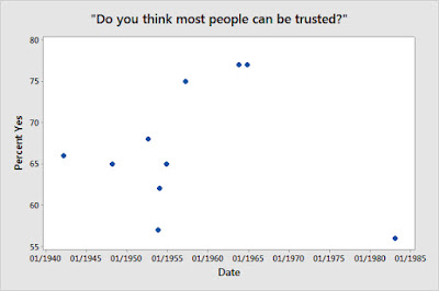
The lowest level of agreement was in 1983 (56%), but it was almost as low in November 1953 (57%). The samples were not all that large, so you could probably make a case that the apparent differences between surveys in the early 1950s were mostly (or maybe all) sampling error. For the same reason, the series doesn't tell us much about long-term change, since there's only one post-1960s observation (I'm not certain of sample size, but I think about 800).
There's one thing that would let us say more about long-term change, which would be if someone would ask the question today. I'm surprised that hasn't been done.
[Data from the Roper Center for Public Opinion Research]
There's another question on trust that's not nearly as well known. Until recently, I either didn't know about it or had forgotten about it. It is "Do you think most people can be trusted?" It was first asked in 1942, and then asked off and on until 1964. After that it has been asked only once, when the GSS included it as an alternate form of its usual trust question. The percentages answering "yes":

The lowest level of agreement was in 1983 (56%), but it was almost as low in November 1953 (57%). The samples were not all that large, so you could probably make a case that the apparent differences between surveys in the early 1950s were mostly (or maybe all) sampling error. For the same reason, the series doesn't tell us much about long-term change, since there's only one post-1960s observation (I'm not certain of sample size, but I think about 800).
There's one thing that would let us say more about long-term change, which would be if someone would ask the question today. I'm surprised that hasn't been done.
[Data from the Roper Center for Public Opinion Research]
Thursday, July 21, 2016
Not about Trump
This post was inspired by a story about the scarcity of Republicans among prominent rock musicians. However, it;s not about Trump, but about an idea in the sociology of culture: that more educated people tend to be "omnivores," who like all genres, rather than liking just a few things. Of course, this doesn't mean that more educated people like every artist better, but that they like "quality" artists from all genres. I recently wrote about a 2009 Pew survey that asked people how well they liked various popular musicians. My impression is that all of the musicians are pretty well regarded by critics, so the "omnivore" idea suggests that education should have a positive correlation with feelings about each one. The correlations, ranging from highest to lowest:
Frank Sinatra 0.157
Beatles 0.144
Bob Dylan 0.119
Bruce Springsteen 0.099
Coldplay 0.092
Madonna 0.089
Aretha Franklin 0.087
Jefferson Airplane 0.074
Grateful Dead 0.053
Rolling Stones 0.042
Michael Jackson -0.009
Jimi Hendrix -0.014
Elvis Presley -0.020
Kanye West -0.064
Nirvana -0.093
Frank Sinatra 0.157
Beatles 0.144
Bob Dylan 0.119
Bruce Springsteen 0.099
Coldplay 0.092
Madonna 0.089
Aretha Franklin 0.087
Jefferson Airplane 0.074
Grateful Dead 0.053
Rolling Stones 0.042
Michael Jackson -0.009
Jimi Hendrix -0.014
Elvis Presley -0.020
Kanye West -0.064
Nirvana -0.093
Education has a positive correlation with views of ten, and a negative correlation with five. Eight of the positive correlations and only two of the negative ones are statistically significant (the standard errors vary, but are mostly about 0.03). So the omnivore hypothesis is right in a general way--more educated people tend to like a broader range of musicians. But there are striking differences among the correlations for different musicians.
Two factors that might affect the correlations are when the musician was most popular, since education might increase the chance of being familiar with the older ones, and whether the musician was a tabloid celebrity, which might make educated people regard them less favorably (even though the question asked about the music, it's hard not to think about the general image). I did a regression with my ratings of when they had their musical peaks and whether they were a tabloid figure, and found some support for both ideas. But there's still significant variation left unexplained. The fact that education has a negative correlation with ratings of Nirvana seems particularly interesting, since although they sold a lot of records, they made a point of being outside the mainstream and not being focused on popular success, qualities that would be expected to increase their relative appeal to educated people.
[Data from the Roper Center for Public Opinion Research]
[Data from the Roper Center for Public Opinion Research]
Saturday, July 16, 2016
Geography of police shootings
The Washington Post has compiled a database of fatal shootings by police in 2015 and 2016. Breaking it down by state seems like an obvious thing to do, but I haven't seen anyone do it, so here are the rates (per 100,000) by state.
Highest:
New Mexico 1.6
Wyoming 1.4
Alaska 1.1
Oklahoma 1.1
DC 1.1
Arizona 1.0
Nevada 0.9
Colorado 0.9
Lowest:
Mass. 0.25
Pennsylvania 0.23
Maine 0.23
Michigan 0.22
New Jersey 0.21
Rhode Island 0.19
New York 0.15
Connecticut 0.14
The general pattern is clear: fatal shootings by police are most common in the West and least common in the Northeast. The South may be a little higher than average, but doesn't stand out: southern states range from 10th (Louisiana) to 35th (Virginia). Of course, there are racial and ethnic differences: 27% of those killed were black and 18% were Hispanic. But controlling for population composition would make the West stand out even more, since the black population is relatively small in those states.
Highest:
New Mexico 1.6
Wyoming 1.4
Alaska 1.1
Oklahoma 1.1
DC 1.1
Arizona 1.0
Nevada 0.9
Colorado 0.9
Lowest:
Mass. 0.25
Pennsylvania 0.23
Maine 0.23
Michigan 0.22
New Jersey 0.21
Rhode Island 0.19
New York 0.15
Connecticut 0.14
The general pattern is clear: fatal shootings by police are most common in the West and least common in the Northeast. The South may be a little higher than average, but doesn't stand out: southern states range from 10th (Louisiana) to 35th (Virginia). Of course, there are racial and ethnic differences: 27% of those killed were black and 18% were Hispanic. But controlling for population composition would make the West stand out even more, since the black population is relatively small in those states.
Subscribe to:
Posts (Atom)